Accessibilitycomponents/Projects.tsx
Legible over any image
Text over photos is tuned against the brightest, busiest image, with margin over the AA floor.
Toggle the WCAG pass
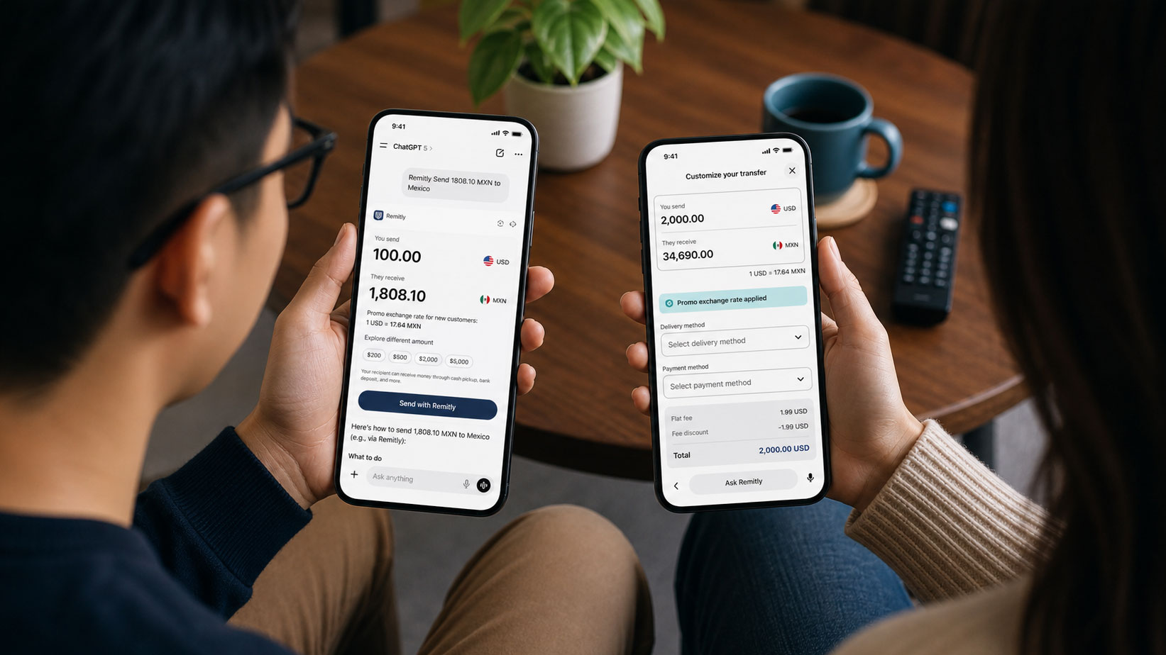
RemitlyConversational AI
Money Transfer on ChatGPT
Company line:4.8:1 marginal
Strengthened gradient (black/80→/90) and bumped text opacities: company line clears the 4.5:1 AA floor comfortably.
components/Projects.tsx
@@ card interior @@- <div className="absolute inset-0 bg-gradient-to-t- from-black/80 via-black/30 to-transparent" />+ <div className="absolute inset-0 bg-gradient-to-t+ from-black/90 via-black/40 to-transparent" /> <div className="absolute inset-x-0 bottom-0 p-6">- <span className="... text-white/60">{project.category}</span>- <p className="... text-white/50">{project.company}</p>+ <span className="... text-white/75">{project.category}</span>+ <p className="... text-white/65">{project.company}</p> <h3 className="... text-white">{project.title}</h3> </div>
- Asked
- Design the work cards so the overlaid text stays legible across any image. WCAG AA is the standard, but optimise for the hardest real case: a bright, high-detail photo underneath.
- Came back
- The first pass passed AA on paper. The company name sat at 4.8 to 1, a hair above the 4.5 floor, and marginal is not done. I had the gradient deepened from 80 to 90 percent black at the base and the two secondary lines lifted, category to 75 percent white and company to 65. The title already cleared AAA. The point was not the numbers; it was that the worst image on the site should stop having a vote in the typography.
- Kept
- Every line over every project photo clears AA with room, so new images can be added without re-testing, and the hierarchy of title, category and company holds whatever is behind it.