Remitly · Conversational AI · Fintech
Shipped Remitly's first agentic remittance — live on ChatGPT.
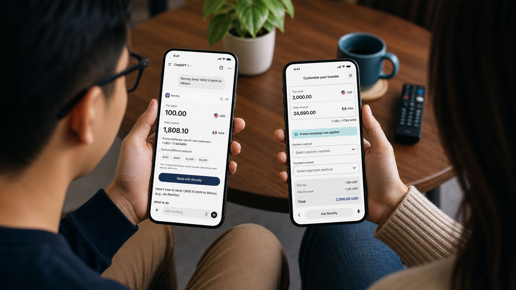
Remitly's first conversational remittance experience for AI platforms.
Context
Wise was already receiving roughly six times more ChatGPT referrals than Remitly. The window to shape how AI platforms remembered remittance — before a competitor became the default — was closing.
Remitly's bet: ship a native transfer experience inside ChatGPT. This was a 0→1 build — first agentic product at the company, no playbook, no pattern library for high-stakes money movement in a conversational UI.
Shipped & Live
Discovery in the ChatGPT app store → inline transfer card → handoff to Remitly.com with context carried forward (no re-entry). Proof before the long read.
The Problem
Remittance UX assumes forms: IDV, rate transparency, disclosures, limits, and errors are all tuned for native apps. In ChatGPT, none of that maps 1:1 — and the model can still generate its own reply beside your widget, with no way to suppress a wrong rate or invented delivery time next to Remitly. I owned the full flow for a surface users don't yet associate with real money, where brand-safe accuracy couldn't be assumed.
What shipped
An end-to-end agentic remittance path in ChatGPT: from natural-language intent through IDV, rate confirmation, disclosures, and an explicit confirmation step before funds move. Trust is carried by language and structure — not by borrowing native-app chrome.
Live on ChatGPT today; Claude and Gemini expansion underway.
The routing logic
Seven decision points across three phases route every prompt to one of four outcomes. The fallback rail ensures unsupported or ambiguous queries always land in Explore — never a broken state.
The three widget outcomes
Each mode is designed for a different user intent and risk profile.
Swipe to explore
When to show it (and when not to)
Routing keys off corridor support and prompt intent — including intent stage. "Send $500 to India" signals readiness for a Send card; "How do I send money to India?" gets education, not a hard conversion surface. A deliberate do-not-trigger list (competitor comparisons, crypto, generic market-rate fishing) kept the product from feeling spammy in contexts where a widget would be off-brand.
Live on ChatGPT
Transfer intent
Natural language query — no special syntax, no app switching required
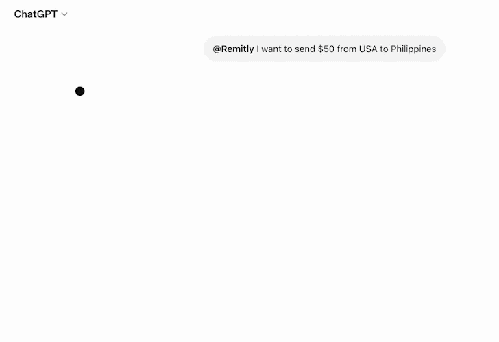
Remitly widget response
Exchange rate, recipient amount, and a single CTA — inline in the conversation
The User Journey
Five beats from first query to Remitly.com — each tuned for consent, clarity, and a clean handoff.
Swipe to explore
The Core Design Moment
Both amounts shown simultaneously
Users see exactly what they send and what the recipient receives — before any commitment. Eliminates the 'I didn't know what they'd get' hesitation that drives abandonment in high-stakes transfer moments.
Exchange rate as a transparency signal, not fine print
The promo rate is surfaced prominently in the card — not disclosed post-click. This is the compliance reframe in action: the same required information, positioned to build confidence rather than trigger alarm.
Single, explicit commitment CTA
One action, one decision — aligned with what we saw consistently in secondary research on conversational money products: users want the agent to gather facts, then an unambiguous beat before funds move.
Impact
1st
In category
First agentic remittance on a major AI platform
2.0K
Sessions
First 30 days — organic ChatGPT discovery, no paid push
75%
Rate lookups
Of all tool calls — routing design held under real usage
Sole
UX lead
Across product, engineering, legal & marketing
What the first 30 days showed
The tool usage breakdown validated the core routing assumption: 75% of all tool calls were exchange rate or cost lookups — Explore and Hybrid modes carried the experience, not Send. Only 0.04% of interactions attempted a direct transfer initiation, confirming that users treat ChatGPT as a research surface, not a transaction surface.
That data shaped v1.1 directly. Amount chips weren't added to speed up checkout — they were added because comparison shopping was the dominant behavior. Surfacing delivery methods inline and reframing the promo rate as a value signal followed the same logic: reduce the unknowns users were already researching before they'd commit to leaving ChatGPT.
What's Next: V1.1
Data-informed iteration. Amount chips let users compare without re-typing; every selection carries forward to Remitly.com — no re-entry at the handoff.
Swipe to explore
“The hardest UX problem wasn't the happy path. It was every moment where a user might lose trust — and designing a clear way back.”
Research & Discovery
I audited how users engaged with conversational interfaces for adjacent financial tasks, mapped the complete transfer flow against ChatGPT's interaction model, and stress-tested every point where trust or compliance could break. I partnered with legal and compliance early — treating each regulatory requirement as a design problem, not a copy-paste obligation.
What the analysis revealed
- Chat users are often exploring, not transacting — native-app trust chrome doesn't exist; language and pacing carry the burden.
- Form-field disclosure copy reads like a warning in chat — framing mattered as much as presence for both users and legal.
- The agent/commit handoff is the highest-stakes moment — people want help gathering facts, then explicit control before money moves.
- IDV failure is the scariest error — calm, plain-language recovery beats technical jargon.
Key Insights
Brand risk sits in the gap between widget and model
ChatGPT can answer beside anything you ship. Where wrong numbers would be catastrophic, Explore bypasses co-generation — Remitly-authored text only — so rates and timelines aren't invented next to the logo.
In-widget state is invisible to the model
Amount changes and delivery picks don't update what the LLM "knows." The UX has to assume stale chat context: scope CTAs to what fits one widget state, and re-trigger when a follow-up needs fresh parameters instead of trusting cross-turn memory.
When there's no UI system, pattern is the system
Hybrid and Explore answers share one four-part skeleton — direct answer, caveat, conditional value prop, then CTA — so users learn what the agent can and can't do without visual scaffolding.
Design Process
Navigating a surface with no playbook
When this project began, ChatGPT's App Store had just launched — almost no public examples existed and there was no internal precedent to draw from. I catalogued every plausible user intent, researched the handful of companies that had shipped early, and built a use case framework that could survive a strict approval process with no guaranteed outcome. Designing for correctness before submission mattered more than iterating after.
Intent-based routing as the core design insight
The central question was what should trigger the Remitly widget — and when it shouldn't appear. The breakthrough was routing on intent rather than query content. "Send $300 to Mexico" and "Is Remitly reliable?" both reference money transfer, but the first is ready to transact; the second is researching. Building the routing system around the purpose behind a question — not its keywords — became the organizing principle for the entire flow and directly shaped the Send / Hybrid / Explore split.
Designing within platform constraints
ChatGPT's architecture imposed hard limits: no payment entry, widget state invisible to the LLM, and model-generated text that could appear beside any widget with no suppression. Rather than treating these as blockers, I treated each as a design requirement. The explicit confirm step, Explore mode, and scoped CTAs all emerged directly from platform realities. Every constraint produced a sharper pattern.
Embedded with engineering, not handing off to it
Given the pace and the novelty of the surface, I stayed embedded with engineering and PM throughout — co-solving in real time rather than handing off designs for async review. Platform limitations often surfaced mid-sprint (the Apple Pay user agent gap, the in-widget state visibility issue), and continuous alignment meant we could redesign a flow in a day. The trust-first approach shipped without a last-minute pushback round because alignment was already built in.
Process Artifact
Two-path flow mapping: direct transfer queries vs. indirect discovery — and what the Remitly card needed to show in each context. Designed alongside PM and engineering to resolve what constituted 'minimum required input' before surfacing the widget.
Widget States & Design Variants
Four interaction states designed for the ChatGPT surface: the core send flow, a hybrid delivery-method selection path, three fee-display format variants, and the open exploratory query state — each considered across both mobile and desktop ChatGPT contexts.
Constraints & Tradeoffs
Widget interactions are invisible to the ChatGPT model
User actions inside the widget — changing an amount, selecting a delivery method — are not visible to the LLM. If a user edits the send amount from $398 to $1,000 inside the widget, then asks a follow-up question in chat, the model still believes the amount is $398. Any conversational logic about rates, limits, or fees operates on potentially stale context.
Designed the flow to treat each widget interaction as self-contained rather than relying on cross-turn context continuity. CTAs were scoped to actions completable within a single widget state. Follow-up questions that required updated context were handled by re-triggering the widget with the new parameters rather than trusting the model to carry state forward.
Explicit user confirmation step vs. agent-confirms-and-executes
Product wanted to minimize taps to improve conversion funnel metrics. Research across conversational financial tools showed users expected an unambiguous 'I am committing to this transfer' moment before money moved — especially in a context they don't yet associate with real transactions.
An explicit confirmation beat was added as a non-negotiable. The flow is one step longer but eliminates the highest-stakes trust failure mode: a transfer the user didn't consciously intend.
What I'd Do Differently
I'd run first-party research with actual Remitly customers who use AI tools before mapping the flow.
We derived behavioral insights from adjacent use cases and competitor analysis. The specific question I'd have answered first: at what point in a ChatGPT conversation does a Remitly customer feel ready to trust a financial widget they didn't explicitly ask for? We designed around a hypothesis. I'd rather have designed around data — and I'd have instrumented first-session widget abandonment from day one.
I'd design a dedicated 'first transfer' state that acknowledges the novelty of the context.
We designed for the generic user. A new Remitly customer making their first transfer inside ChatGPT is in a qualitatively different psychological moment than a returning user — that transition deserved its own design pass.
Reflection
The entire routing model was built on an assumption I couldn't yet prove: that most users reaching Remitly through ChatGPT were researching and comparing, not ready to send. That assumption held — 75% of tool calls were rate lookups. But I made the call on inference from adjacent behaviors, not from watching actual Remitly users in an AI context. What I'd do differently: instrument whether users were in research or transaction mode from day one, so I'm validating the assumption in days instead of waiting 30 days to find out if the design was right.