
A redesign of the online permit application websites of three departments of Maricopa County.
Independence Project: Ann Lei
Responsibilities: User Experience Design, User Interface Design, User Flow, Wireframe, Prototype, Concept Development, Ideation, Research
Timeline: 7 weeks
Storyboard Illustrator: Danqi Zhang
Software: Sketch, Flinto, Adobe Illustrator, Photoshop
Maricopa County has multiple departments with different servers that cause confusion for users while applying for permits.
The project was a collaboration with Maricopa County Innovation Studio Department to focus on the permitting services website of three departments, which are Planning and Development, Environmental Services, and Air Quality. The goal of Maricopa County was for users to successfully complete online permit applications in the first attempt.

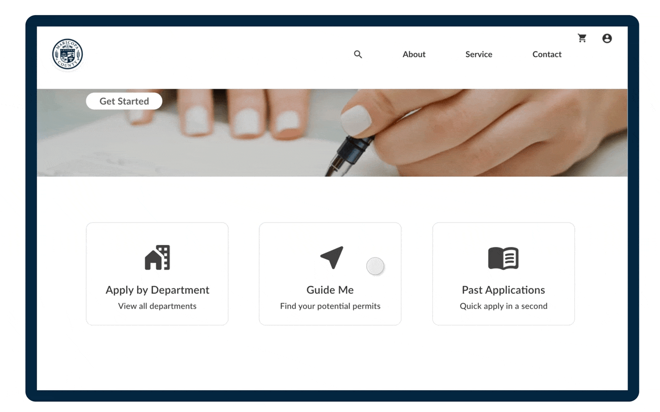
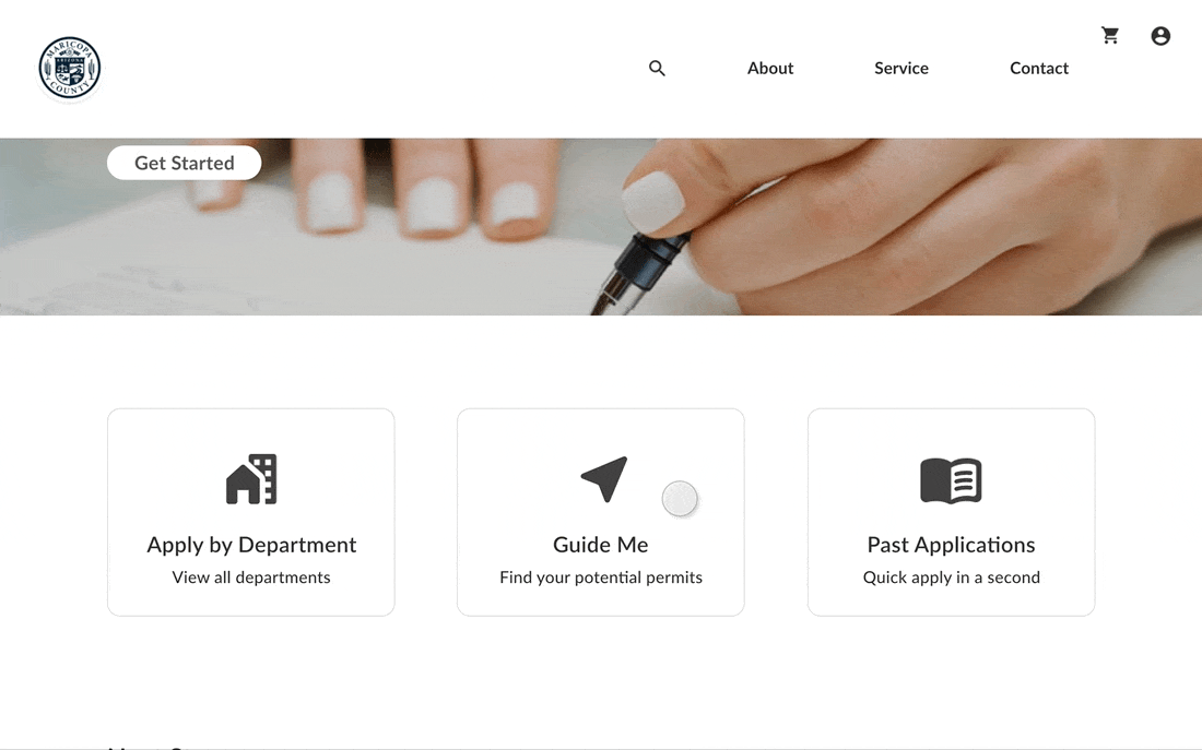
We provide a step by step guidance for users to decrease overwhelming text to find the department and potential permits they are looking for.
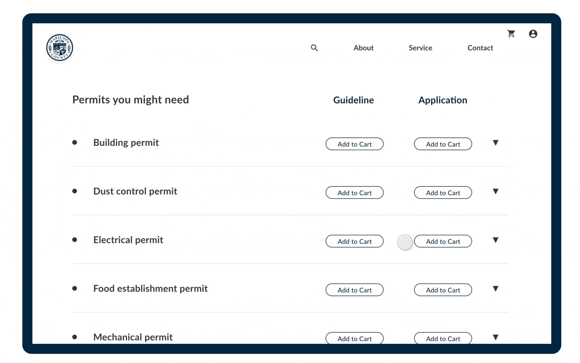
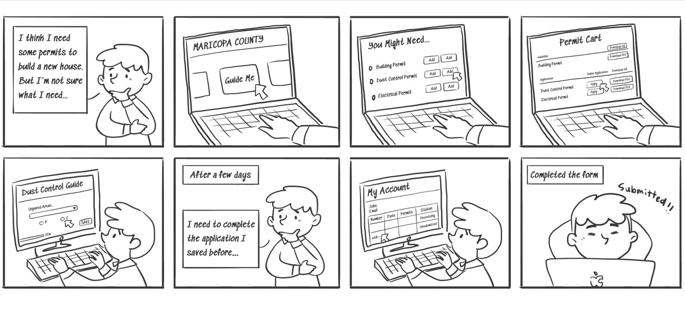
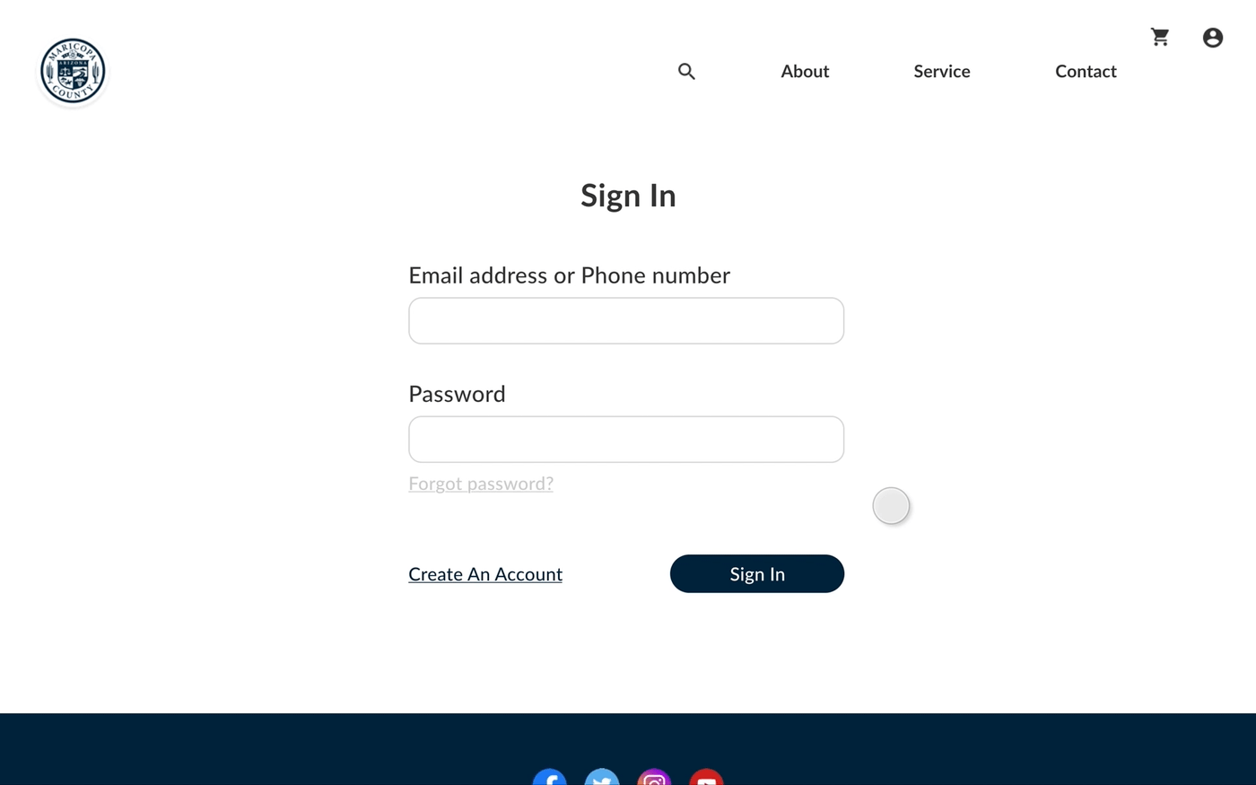
This feature allows users to save their progress in their account and work on it later if they need to get documents from other parties.
Applicants can not only work on permit applications whenever they wish to, but also view the application status in their accounts. In addition, all the previously inputted information are saved and allowed for autofill in the future.
The complexity of departments and the inefficiency of the system cause confusion for users while applying for permits. Users often chose the wrong department to apply to, and sometimes even had to go through the application process multiple times. For example, the pdf application form could not undo boxes users had checked. The only way to fix it was to close the tab and start all over again. Additionally, there was no way for users to save the application and work on it later.
Due to the heavy text of information for the application process, most users tend to skip it and that causes mistakes while applying. In addition, Maricopa County seems to lack clear instructions of what is necessary for the application and have some usability issues.

Users are often confused by instructions written at the beginning of the application process.
Applicants usually call and ask for guidance to fill out the application. After the permit is submitted, they often ask for the status of the application.

Our goal was to generate as many innovative and creative ideas as possible. We started with creating storyboards to imagine the experience we envision for users.


The concept was selected based on how well it targets the problems we found through the research.

The initial concept was tested in depth with the client in five rounds of two people group setting.
"It would be nice to know how far I am in the Guide Me process." - Client #5
"Combining these two concepts is exactly what we wanted." - Client #1
"Shopping cart would definitely help with the stress of users due to the complication of our permits." - Client #3
"Autofill is a great idea. We have so many common information that users need to fill in more than once." - Client #8
This would give users an understanding of how far they are from the final result.

The final version has both Guide Me and Account Page for users to apply for permits and keep track of their progress.
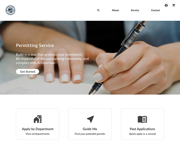
The shopping cart allows users to apply for their permits online and find the documents to download if they wish to apply in person.

I mainly used images and icons, also decreased the amount of text to provide users a less stressful and overwhelming experience.


Even though we were improving the experience for people who were applying for permits, we learned a lot from the officers who were dealing with the paperwork. There were certain restrictions Maricopa County couldn't change due to the rule from the government. Regardless of how much we wanted to improve the experience for users, it is impossible to change it without the reformation of the system from the government.
The difficulty of redesigning a website is that there was an existing framework already. It is important to start with the user needs and target the user problems. It takes extra work to rebuild the layout and user flows but it is definitely worth the time.
The mid-stage presentation and testing with clients have helped me understand more underlying problems we didn't find during the initial research. Having the feedback directly from people who have been working at the office is crucial and it elevated the final concept.
